Introduction
If you have ever opened a trading platform like Zerodha, Groww, or Angel One, you were likely greeted by a screen filled with flashing red and green vertical rectangles. To the untrained eye, these charts look like a chaotic digital heartbeat monitor. However, for successful traders and investors, these shapes are the ultimate storytelling tool. They are called candlestick charts, and mastering them is your first major step toward financial literacy and independence in the stock market.
Learning how to read candlestick charts for beginners is akin to learning the alphabet before trying to write a novel. Whether you want to day trade options in Nifty, swing trade mid-cap stocks, or time your long-term entries into blue-chip giants like Reliance or Tata Motors, candlesticks offer an immediate window into market psychology. Instead of relying on blind rumors or social media tips, reading these charts enables you to base your decisions on cold, hard data.
The Core Benefits of Candlestick Charts
- Visualizing Market Sentiment: They show you instantly who is winning the tug-of-war between buyers (bulls) and sellers (bears).
- Spotting Trend Reversals Early: Certain shapes warn you that a rising stock is about to fall, or that a crashing stock is finding a bottom.
- Planning Precise Entry and Exit Points: They eliminate guesswork, telling you exactly where to buy to maximize gains and where to set a stop-loss to minimize risk.
- Adaptability Across All Timeframes: You can use these charts for 5-minute intraday trading or weekly charts for long-term investment chart interpretation.
What It Is and Why It Matters
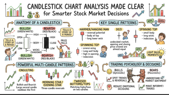
What it is: A candlestick chart is a visual method of displaying the price movements of an asset—like a stock, commodity, or cryptocurrency—over a specific period of time. Each “candle” represents a single unit of time (e.g., 1 minute, 15 minutes, 1 hour, or 1 day) and details four critical data points: the Open, High, Low, and Close prices (OHLC).
Why it matters: Unlike simple line charts that only track closing prices, candlestick charts reveal the emotional battleground of the market. They show the exact path price took during the day, capturing the panic of sellers and the euphoria of buyers. By mastering these candlestick signals, beginners can move past emotional trading and begin practicing systematic price action analysis, transforming market volatility into structured trading opportunities.
Basic Components of a Candlestick
To establish solid candlestick chart basics, you must learn to dissect a single candle. Every candlestick consists of three distinct parts: the real body, the upper shadow, and the lower shadow (shadows are also widely referred to as “wicks”).
Together, these components map out the OHLC structure for whatever timeframe you have selected.
      [High Price]
           |          <-- Upper Shadow / Wick
     +-----------+
     |   Open    |    <-- Top of Body (Bearish / Red Candle)
     |           |        OR Close Price (Bullish / Green Candle)
     | Real Body |
     |           |        Top of Body (Bullish / Green Candle)
     |   Close   |    <-- OR Open Price (Bearish / Red Candle)
     +-----------+
           |          <-- Lower Shadow / Wick
      [Low Price]
1. The Real Body
The thick, rectangular middle portion of the candlestick is called the real body. This section illustrates the price distance between the opening bell and the closing bell of that specific timeframe.
- If the body is long, it indicates intense buying or selling pressure.
- If the body is short, it suggests that the market was quiet or indecisive, with minimal price movement between the open and close.
2. The Color Coding (Bullish vs. Bearish Signals)
Color is your quickest visual cue when executing technical analysis for beginners. In modern trading terminals, candlesticks are colored green or red.
- Green (Bullish Candle): When the closing price is higher than the opening price, the candle turns green. This tells you that buyers dominated the session, driving prices upward.
- Red (Bearish Candle): When the closing price is lower than the opening price, the candle turns red. This indicates that sellers took control, dragging the stock price down.
3. The Shadows / Wicks
The thin lines extending above and below the real body are called shadows, wicks, or tails. These represent the highest and lowest prices reached during the time session.
- Upper Shadow: The peak of the top wick represents the High price—the absolute highest point buyers managed to push the stock before sellers pushed it back down.
- Lower Shadow: The tip of the bottom wick represents the Low price—the absolute lowest depth sellers dragged the stock before buyers stepped in to pick it back up.
Common Candlestick Patterns
| Pattern | Signal | How to Interpret |
| Doji | Indecision | The open and close prices are nearly identical. It shows a perfect tie between bulls and bears; a potential trend reversal is brewing. |
| Hammer | Bullish | Features a small upper body and a long lower wick. Appears at the bottom of a downtrend, signaling that buyers rejected lower prices. |
| Hanging Man | Bearish | Visually identical to a hammer but forms at the peak of an uptrend. It signals that heavy selling pressure is starting to emerge. |
| Bullish Engulfing | Bullish | A large green candle completely swallows the body of the previous small red candle. Shows an aggressive surge in buying momentum. |
| Bearish Engulfing | Bearish | A large red candle completely overwhelms the preceding small green candle. It acts as a clear, strong sell signal. |
| Morning Star | Bullish | A three-candle pattern: a long red candle, a short-bodied middle star, and a long green candle. Signals a macro shift from a downtrend to an uptrend. |
| Evening Star | Bearish | A three-candle top-reversal pattern: a long green candle, a small star, and a large red candle closing deep inside the first candle’s body. |
Step-by-Step Guide to Reading Candlestick Charts
Step 1: Identify the Macro Market Trend
Before looking at individual candles, look at the big picture. Is the stock in an uptrend, a downtrend, or a sideways trend?
- Uptrend: Marked by a sequence of higher highs and higher lows. Green candles will generally dominate the landscape.
- Downtrend: Marked by lower highs and lower lows, dominated by cascading red candles.
- Sideways (Consolidation): The stock bounces between a flat ceiling and a flat floor.
Always trade in the direction of the broader trend; remember, the trend is your friend.
Step 2: Recognize Candlestick Colors and Shapes
Zoom into the most recent 3 to 5 candlesticks. Are the bodies expanding or shrinking?
- For example, if you notice that the red candles are getting smaller and smaller as the stock drops, it indicates that sellers are losing their momentum.
- Conversely, if sudden, massive green candles appear out of nowhere, it proves that a powerful institutional buyer has likely entered the arena.
Step 3: Spot Key Reversal Patterns
Look for the specific visual triggers outlined in our candlestick patterns explained section. Is there a Hammer forming right after a multi-day sell-off? Or perhaps an Evening Star has emerged while the stock is trading at an all-time high? Identifying these shapes alerts your brain to prepare for a sudden change in market direction.
Step 4: Analyze Support and Resistance Levels
A candlestick pattern is only as good as where it appears on the chart. Support is the psychological floor where a falling stock historically finds buyers. Resistance is the psychological ceiling where a rising stock historically encounters sellers.
- A bullish Hammer is incredibly powerful if it forms directly on a major support line.
- However, if that same Hammer forms in the middle of nowhere, it carries significantly less weight and should often be ignored.
Step 5: Combine Patterns with Volume for Confirmation
Volume represents the total number of shares traded during a given timeframe, displayed as vertical bars at the very bottom of your chart. Think of volume as the fuel for the candlestick.
- If you spot a Bullish Engulfing pattern on massive volume, it means the big players (Mutual Funds, FIIs, DIIs) are actively buying, making the signal highly reliable.
- If the same pattern occurs on thin, below-average volume, it may be a false alarm or a temporary trap.
Real-Life Examples
To help solidify your reading stock charts capability, let’s look at five practical scenarios reflecting how everyday market participants interpret candlestick movements:
- The Patient Reversal Buyer: A beginner spots a classic hammer pattern on Tata Motors after a two-week downtrend, notices it sits right on a historical support level, and waits for the next candle to close green before safely buying shares.
- The Trend Rider: A swing trader notices a massive bullish engulfing pattern on State Bank of India (SBI) on high volume, interpreting it as a surge in institutional demand, and decides to hold their position for further upside.
- The Indecision Lesson: A student misreads an isolated doji candle as an immediate buy signal, suffers a quick loss, and learns that a doji simply indicates market indecision and requires high volume confirmation to be valid.
- The Timing Professional: A salaried professional tracking Infosys uses an hourly candlestick trading guide approach, spotting a clear morning star pattern at 11:30 AM to perfectly time their entry into an emerging daily uptrend.
- The Risk Manager: A new investor identifies a prominent evening star pattern near the resistance zone of a mid-cap stock, enters a short-term trade, and sets a strict stop-loss just above the pattern’s highest wick to protect their capital.
Practical Tips for Beginners
Stepping into the world of technical analysis can feel overwhelming. Implement these foundational strategies to protect your trading account while accelerating your learning curve.
- Never Trade on a Single Candlestick Alone: A single candle shows you a snapshot of sentiment, not a complete roadmap. Always combine your candle analysis with trendlines, moving averages (like the 50-day or 200-day EMA), and RSI indicators.
- Always Wait for the Candle to Close: This is a golden rule in a beginner stock charts manual. A candlestick can look like a beautiful, powerful green hammer with 2 minutes left in the trading session, but a last-second sell-off can turn it into a bearish hanging man. Never take action until the timeframe candle fully closes.
- Backtest on Historical Charts: Before risking your hard-earned money, open up a free charting platform like TradingView. Pull up older charts of historical Indian stocks, scroll back a year, and manually look for hammers, dojis, and engulfing patterns to see how subsequent price actions played out.
- Keep a Structured Trading Journal: Document every trade you make. Take a screenshot of the candlestick chart pattern that triggered your trade, note down the volume, write out your risk-to-reward ratio, and record the eventual financial outcome. This helps you systematically discover which setups work best for your personal style.
The Ultimate Candlestick Reading Checklist
| Checklist Point | Status | Operational Action Required |
| 1. Trend Identified? | Yes / No | Determine if the macro asset trend is up, down, or sideways. |
| 2. Candle Colors Interpreted? | Yes / No | Verify whether bulls (green) or bears (red) won the latest session. |
| 3. Key Reversal Patterns Noted? | Yes / No | Look for high-probability shapes like Hammers, Dojis, or Engulfing lines. |
| 4. Support/Resistance Checked? | Yes / No | Ensure the pattern is resting perfectly on a historical price floor or ceiling. |
| 5. Volume Analyzed? | Yes / No | Confirm that the trading volume is above average to validate the move. |
| 6. Entry/Exit Points Planned? | Yes / No | Map out the exact entry price and targets before placing the order. |
| 7. Risk Management in Place? | Yes / No | Calculate your precise position size and set a hard stop-loss order. |
| 8. Historical Context Practiced? | Yes / No | Check if this specific pattern has worked well on this asset in the past. |
| 9. Journal Data Recorded? | Yes / No | Log the chart screenshot and setup details into your trading journal. |
| 10. Indicators Combined? | Yes / No | Supplement the candle pattern with a secondary tool like RSI or a Moving Average. |
Common Mistakes Beginners Make
Even with charts right in front of them, rookie traders frequently fall into predictable traps. Being aware of these common pitfalls will save you thousands of rupees in avoidable losses.
Overtrading on Low Timeframes
Beginners often pull up a 1-minute or 3-minute chart and try to trade every single candlestick pattern they see. On tiny timeframes, there is an immense amount of market “noise.” A hammer pattern on a 1-minute chart fails frequently; however, a hammer pattern on a daily or weekly chart carries immense macro-economic significance. Stick to higher timeframes (15-minute, 1-hour, or Daily) when you are starting out.
Ignoring the Broader Market Context
If the entire Nifty 50 index is crashing by 3% due to bad global news, trying to buy an individual stock just because it formed a small bullish candlestick is a recipe for disaster.
Individual stocks generally follow the macro direction of the broader stock market index. Always look at what the overall market is doing before focusing on single tickers.
Trading Without a Stop-Loss
No candlestick pattern is 100% accurate. Technical analysis maps out probabilities, not absolute certainties. Some traders get overconfident because they spotted a perfect “textbook” engulfing pattern, invest too heavily, and use no protection. If the trade goes against you, a stop-loss is your emergency seatbelt that exits the position automatically before a small loss snowballs into financial ruin.
Frequently Asked Questions (FAQs)
1. What is a candlestick chart?
A candlestick chart is a highly efficient visual method of tracking financial price movements over time. Each individual candle highlights the open, high, low, and close prices (OHLC) for a specific set timeframe, reflecting the psychological battle between buyers and sellers.
2. How do I identify bullish and bearish candlesticks?
Look at the color of the real body. A green candle is bullish, meaning the stock closed higher than it opened. A red candle is bearish, indicating the stock closed lower than its initial opening price.
3. What are the most important candlestick patterns for beginners?
The most reliable foundational patterns for beginners to study are the Doji (indecision), the Hammer (bullish reversal), the Bearish Engulfing (strong downward pressure), and the Morning Star (macro bottom reversal).
4. Can candlestick charts predict stock prices accurately?
Candlestick charts do not predict the future with absolute certainty. Instead, they analyze historical price action to map out high-probability outcomes, helping you make structured, calculated trading setups.
5. How do I combine candlestick analysis with trendlines?
Draw trendlines connecting consecutive higher lows in an uptrend. When the stock pulls back to touch that rising trendline and forms a bullish candlestick pattern (like a hammer), it provides a high-probability entry signal.
6. Should I rely solely on candlestick charts for trading?
No. While candlesticks are an incredible tool for price action analysis, they should always be used alongside other reliable technical metrics, such as volume, horizontal support and resistance zones, and momentum indicators like the RSI.
7. How does volume affect candlestick interpretation?
Volume serves as validation. A major pattern change on high volume proves that institutional investors are backing the move, whereas a pattern on low volume suggests a weak move that could easily trap rookie traders.
8. How often should I check charts?
This depends entirely on your strategy. If you are a long-term investor, checking weekly or daily charts once a day is plenty. If you are a swing trader, reviewing charts at the market open and close is ideal. Avoid staring at charts all day to prevent emotional decision-making.
9. What mistakes do beginners commonly make with candlesticks?
Rookies frequently trade on micro timeframes (like 1-minute charts), execute trades before a candle has officially closed, ignore support and resistance lines, and trade without setting a hard stop-loss order.
10. Are candlestick charts useful for long-term investors?
Yes. Long-term investors use weekly and monthly candlestick charts for investment chart interpretation. It helps them avoid buying a great stock at an overvalued peak and allows them to accumulate shares when the asset hits a long-term bottom.
Conclusion
Mastering how to read candlestick charts for beginners is a foundational step on your path through the financial markets. These charts offer far more than just visual data; they provide a real-time window into market psychology, highlighting the balance between fear and greed. By learning to identify the components of a candle, recognizing high-probability patterns, and validating them with support, resistance, and volume, you can transition from speculative trading to systematic, data-driven execution.
Remember that patience is your greatest asset. Avoid the temptation to rush into live trading based on a single pattern. Take the time to practice reading charts, backtest setups using historical data, and always prioritize risk management.