Introduction
Data visualization tools allow organizations to turn complex data into intuitive charts, graphs, and dashboards. They help users quickly identify trends, patterns, and insights for better decision-making. Essentially, these tools make data understandable and actionable across teams and stakeholders.
With the growing importance of analytics and real-time reporting, visualization tools are essential to bridge the gap between raw data and actionable insights. Clear visualizations improve communication, reduce misinterpretation, and enable faster business decisions.
Real-world use cases include:
- Monitoring KPIs and performance dashboards for teams.
- Visualizing customer behavior and sales trends.
- Presenting analytics to stakeholders in reports or board meetings.
- Identifying anomalies or trends in financial, operational, or marketing data.
- Supporting data storytelling for presentations and strategic planning.
Key evaluation criteria for buyers:
- Variety of visualization types and chart options.
- Real-time and interactive dashboards.
- Ease of use for non-technical users.
- Integration with data sources and platforms.
- Collaboration and sharing capabilities.
- Scalability for large datasets.
- Customization and advanced analytics support.
- Security and compliance features.
- Pricing flexibility and value.
Best for:
Data visualization tools are ideal for data analysts, business users, and managers across organizations of all sizes looking to present data clearly and make informed decisions.
Not ideal for:
Organizations with minimal data analysis needs or small datasets may not require full-featured visualization tools; simpler charting solutions or spreadsheet tools may suffice.
Key Trends in Data Visualization Tools
- Interactive dashboards: Users can explore and filter data dynamically.
- AI-assisted visualization: Tools recommend optimal chart types and highlight key insights.
- Embedded analytics: Visualizations integrated into applications and workflows.
- Cloud-first deployment: Cloud-based dashboards for collaboration and accessibility.
- Mobile-ready dashboards: Access insights on smartphones and tablets.
- Real-time analytics: Dashboards update live with streaming data.
- Collaboration and sharing: Teams can annotate, comment, and share dashboards.
- Advanced visualizations: Support for geospatial, network, and 3D visualizations.
- Integration with modern data stacks: Seamless connection to cloud warehouses and BI platforms.
- Governance and security: Role-based access, encryption, and compliance-ready features.
How We Selected These Tools (Methodology)
- Reviewed market adoption and popularity among analytics and business users.
- Evaluated feature completeness, including chart types, dashboards, interactivity, and AI recommendations.
- Assessed performance and reliability for handling large and real-time datasets.
- Considered integration capabilities with data warehouses, ETL pipelines, and BI platforms.
- Checked security and compliance features.
- Factored in ease of use for non-technical users.
- Analyzed support and community resources.
- Reviewed customization and advanced analytics support.
- Evaluated pricing and value for teams of different sizes.
- Ensured applicability for SMB to enterprise organizations.
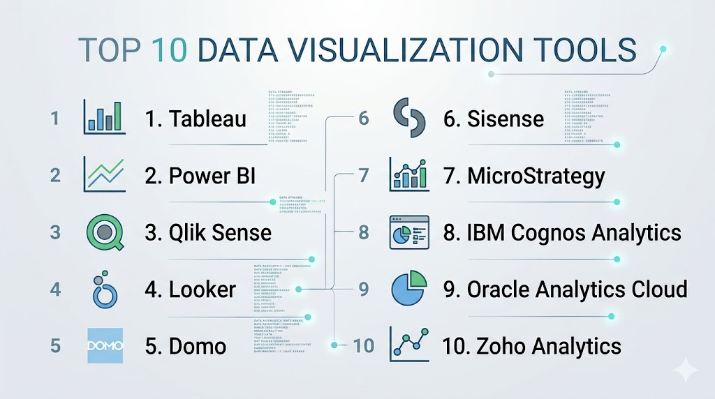
Top 10 Data Visualization Tools
#1 — Tableau
Short description: Tableau provides interactive dashboards, visual analytics, and real-time data visualization for business users and data teams.
Key Features
- Drag-and-drop dashboard creation
- Wide variety of chart types
- Real-time data monitoring
- AI-driven insights and recommendations
- Mobile-friendly dashboards
- Integration with multiple data sources
- Collaboration and sharing tools
Pros
- Highly intuitive and visually compelling
- Strong community and support resources
Cons
- Can be expensive for large teams
- Performance may lag with extremely large datasets
Platforms / Deployment
- Web / Windows / macOS
- Cloud / On-prem / Hybrid
Security & Compliance
- SSO, encryption, RBAC
- SOC 2, GDPR
Integrations & Ecosystem
- Snowflake, Redshift, BigQuery, SQL, Salesforce
- APIs for custom workflows
Support & Community
- Professional support tiers
- Large, active community
#2 — Power BI
Short description: Microsoft Power BI is a versatile visualization tool with integration into Microsoft 365 and cloud services.
Key Features
- Drag-and-drop dashboard creation
- Real-time analytics and alerts
- AI-assisted data visualization
- Natural language query support
- Integration with Excel and Azure
- Mobile dashboards and reports
- Collaboration and sharing
Pros
- Deep Microsoft ecosystem integration
- Affordable licensing for smaller teams
Cons
- Limited customization for highly complex visualizations
- Can be slower with very large datasets
Platforms / Deployment
- Web / Windows / iOS / Android
- Cloud / On-prem / Hybrid
Security & Compliance
- SSO, RBAC, encryption
- SOC 2, GDPR
Integrations & Ecosystem
- SQL Server, Azure, Excel, SharePoint
- APIs for embedding
Support & Community
- Microsoft support
- Extensive user community
#3 — Qlik Sense
Short description: Qlik Sense provides self-service data visualization and associative analytics with interactive dashboards.
Key Features
- Associative data model for exploration
- AI-driven visualization recommendations
- Interactive dashboards
- Collaboration features
- Integration with multiple data sources
- Mobile-ready dashboards
Pros
- Strong data exploration capabilities
- Flexible deployment options
Cons
- Steeper learning curve for beginners
- Can be costly
Platforms / Deployment
- Web / Windows / macOS / iOS / Android
- Cloud / On-prem / Hybrid
Security & Compliance
- SSO, RBAC, encryption
- SOC 2
Integrations & Ecosystem
- Databases, ETL, BI connectors
Support & Community
- Professional support
- Active user community
#4 — Looker
Short description: Looker provides cloud-based visualization and dashboards with modeling capabilities using LookML.
Key Features
- Interactive dashboards
- Real-time data visualization
- Embedded analytics
- Data modeling with LookML
- Cloud-native deployment
- Collaboration tools
Pros
- Excellent for cloud-first teams
- Strong modeling for accurate insights
Cons
- Requires LookML knowledge
- Higher cost for smaller teams
Platforms / Deployment
- Web
- Cloud
Security & Compliance
- SSO, RBAC, encryption
- SOC 2, GDPR
Integrations & Ecosystem
- BigQuery, Snowflake, Redshift, DBT
- APIs for embedding
Support & Community
- Professional services
- Growing community
#5 — Domo
Short description: Domo offers cloud-based dashboards and visualization with real-time analytics for business teams.
Key Features
- Cloud-native dashboards
- Real-time data visualization
- Prebuilt data connectors
- Collaboration and sharing
- AI-driven insights
- Mobile access
Pros
- Fast deployment
- Easy-to-use interface
Cons
- Enterprise pricing is high
- Limited advanced customization
Platforms / Deployment
- Web / iOS / Android
- Cloud
Security & Compliance
- SSO, encryption, RBAC
- SOC 2
Integrations & Ecosystem
- Salesforce, Snowflake, Redshift, Google Sheets
- APIs for custom connectors
Support & Community
- Professional support
- Training resources
#6 — Sisense
Short description: Sisense provides advanced dashboards and embedded analytics for complex datasets.
Key Features
- In-chip analytics for fast processing
- Embedded BI
- Interactive dashboards
- AI-powered insights
- Integration with multiple data sources
Pros
- Handles large datasets efficiently
- Good for embedded analytics
Cons
- Requires technical expertise
- Complex for small teams
Platforms / Deployment
- Web / Windows / macOS
- Cloud / On-prem / Hybrid
Security & Compliance
- SSO, RBAC, encryption
- SOC 2
Integrations & Ecosystem
- Snowflake, Redshift, BigQuery, Excel
Support & Community
- Enterprise support
- Community forums
#7 — MicroStrategy
Short description: MicroStrategy provides enterprise-level dashboards, visualization, and analytics.
Key Features
- Interactive dashboards
- Predictive analytics
- Mobile BI
- Embedded analytics
- Integration with multiple data sources
Pros
- Highly scalable
- Enterprise-grade features
Cons
- Steep learning curve
- High cost
Platforms / Deployment
- Web / Windows / macOS / iOS / Android
- Cloud / On-prem / Hybrid
Security & Compliance
- SSO, RBAC, encryption
- SOC 2
Integrations & Ecosystem
- SQL databases, cloud warehouses, ETL pipelines
Support & Community
- Professional support
- Established community
#8 — IBM Cognos Analytics
Short description: IBM Cognos offers AI-assisted dashboards, reporting, and visualization for enterprise users.
Key Features
- AI-powered insights
- Dashboards and reports
- Predictive analytics
- Data exploration and visualization
- Collaboration tools
Pros
- Enterprise-ready analytics
- Strong AI features
Cons
- Complex setup
- Requires training
Platforms / Deployment
- Web / Windows / macOS
- Cloud / On-prem / Hybrid
Security & Compliance
- SSO, RBAC, encryption
- SOC 2, GDPR
Integrations & Ecosystem
- Databases, ETL, cloud warehouses
Support & Community
- Enterprise support
- IBM community
#9 — Oracle Analytics Cloud
Short description: Oracle Analytics Cloud provides dashboards, visualizations, and embedded analytics in a cloud-native platform.
Key Features
- Cloud dashboards
- Predictive analytics
- Embedded visualization
- Real-time reporting
- Integration with Oracle and external data sources
Pros
- Strong cloud integration
- AI-powered insights
Cons
- Limited outside Oracle ecosystem
- Higher licensing costs
Platforms / Deployment
- Web
- Cloud
Security & Compliance
- SSO, RBAC, encryption
- SOC 2, GDPR
Integrations & Ecosystem
- Oracle DB, Exadata, ERP, cloud warehouses
Support & Community
- Oracle support
- Active user community
#10 — Zoho Analytics
Short description: Zoho Analytics is an affordable BI and visualization tool for SMBs and mid-market teams.
Key Features
- Drag-and-drop dashboards
- AI-driven visualization
- Data integration with multiple sources
- Collaboration features
- Mobile-friendly dashboards
Pros
- Affordable and easy to deploy
- Quick onboarding
Cons
- Limited enterprise scalability
- Fewer advanced analytics
Platforms / Deployment
- Web / iOS / Android
- Cloud
Security & Compliance
- SSO, RBAC, encryption
- SOC 2
Integrations & Ecosystem
- Zoho Suite, Salesforce, SQL databases, cloud warehouses
Support & Community
- Professional support
- Online knowledge base
Comparison Table (Top 10)
| Tool Name | Best For | Platform(s) Supported | Deployment | Standout Feature | Public Rating |
|---|---|---|---|---|---|
| Tableau | Visual analytics | Web / Windows / macOS | Cloud / On-prem / Hybrid | Advanced dashboards | N/A |
| Power BI | Microsoft ecosystem | Web / Windows / iOS / Android | Cloud / On-prem / Hybrid | Office 365 integration | N/A |
| Qlik Sense | Self-service analytics | Web / Windows / macOS / iOS / Android | Cloud / On-prem / Hybrid | Associative model | N/A |
| Looker | Cloud analytics | Web | Cloud | Embedded analytics | N/A |
| Domo | Cloud dashboards | Web / iOS / Android | Cloud | Real-time dashboards | N/A |
| Sisense | Embedded analytics | Web / Windows / macOS | Cloud / On-prem / Hybrid | In-chip analytics | N/A |
| MicroStrategy | Enterprise BI | Web / Windows / macOS / iOS / Android | Cloud / On-prem / Hybrid | Predictive analytics | N/A |
| IBM Cognos Analytics | AI-driven BI | Web / Windows / macOS | Cloud / On-prem / Hybrid | AI insights | N/A |
| Oracle Analytics Cloud | Oracle ecosystem | Web | Cloud | Cloud dashboards | N/A |
| Zoho Analytics | SMB analytics | Web / iOS / Android | Cloud | AI insights | N/A |
Evaluation & Scoring of Data Visualization Tools
| Tool Name | Core (25%) | Ease (15%) | Integrations (15%) | Security (10%) | Performance (10%) | Support (10%) | Value (15%) | Weighted Total (0–10) |
|---|---|---|---|---|---|---|---|---|
| Tableau | 9 | 8 | 8 | 9 | 8 | 8 | 6 | 8.0 |
| Power BI | 8 | 9 | 8 | 8 | 8 | 8 | 9 | 8.4 |
| Qlik Sense | 8 | 7 | 7 | 8 | 8 | 7 | 7 | 7.5 |
| Looker | 8 | 7 | 7 | 8 | 8 | 7 | 7 | 7.5 |
| Domo | 7 | 8 | 7 | 7 | 7 | 7 | 6 | 7.1 |
| Sisense | 8 | 7 | 7 | 8 | 8 | 7 | 7 | 7.5 |
| MicroStrategy | 9 | 6 | 7 | 8 | 8 | 7 | 6 | 7.5 |
| IBM Cognos | 8 | 7 | 7 | 8 | 8 | 7 | 6 | 7.3 |
| Oracle Analytics | 8 | 7 | 7 | 8 | 8 | 7 | 6 | 7.3 |
| Zoho Analytics | 7 | 8 | 6 | 7 | 7 | 7 | 8 | 7.1 |
Which Data Visualization Tool Is Right for You?
Solo / Freelancer
Zoho Analytics or Power BI is ideal for individuals and small teams needing affordable and easy dashboards.
SMB
Domo, Power BI, or Qlik Sense provides self-service visualization and collaboration features for mid-sized teams.
Mid-Market
Tableau, Looker, or Sisense offers scalable, interactive dashboards with real-time and predictive insights.
Enterprise
MicroStrategy, IBM Cognos, or Oracle Analytics Cloud provides enterprise-grade dashboards, advanced analytics, and embedded visualizations.
Budget vs Premium
Budget-conscious teams may choose Zoho Analytics or Domo, while enterprise teams needing advanced features should consider Tableau, MicroStrategy, or IBM Cognos.
Feature Depth vs Ease of Use
Feature-rich tools (Tableau, MicroStrategy) provide comprehensive insights but require training; simpler tools (Zoho, Power BI) offer faster adoption.
Integrations & Scalability
Select tools that integrate with your data sources, warehouses, and ETL pipelines for seamless and scalable analytics.
Security & Compliance Needs
Ensure encryption, SSO, RBAC, and compliance features for sensitive or regulated data.
Frequently Asked Questions (FAQs)
What is a data visualization tool?
It transforms raw data into charts, dashboards, and graphs, enabling users to understand and act on insights.
Can small teams use these tools?
Yes, tools like Zoho Analytics and Power BI are affordable and quick to deploy for small teams.
Do these tools support real-time dashboards?
Most modern visualization tools support live dashboards that update as new data arrives.
Are these tools AI-enabled?
Many provide AI-powered insights, trend detection, and automated visualization recommendations.
Can non-technical users create dashboards?
Yes, self-service BI and visualization tools enable non-technical users to build dashboards easily.
How do these tools integrate with other systems?
They connect to databases, cloud warehouses, spreadsheets, ETL pipelines, and BI platforms through connectors or APIs.
Are mobile dashboards available?
Most tools offer mobile apps for dashboards and reports on smartphones or tablets.
How secure are these tools?
Enterprise-grade tools provide SSO, RBAC, encryption, and compliance with standards like SOC 2 or GDPR.
Can these tools replace manual reporting?
Yes, they automate data visualization and reporting, reducing errors and effort.
How long does deployment take?
Cloud-based tools can be ready in days; on-premises deployments may take weeks depending on complexity.
Conclusion
Data visualization tools are critical for transforming raw data into actionable insights through charts, dashboards, and interactive reports. Choosing the right tool depends on team size, data complexity, budget, and integration requirements. Small teams can leverage Zoho Analytics or Power BI, while mid-market organizations benefit from Domo, Qlik Sense, or Looker for interactive dashboards and predictive insights. Enterprises requiring large-scale visualization, embedded analytics, and AI-powered insights may opt for Tableau, MicroStrategy, or IBM Cognos Analytics. Important factors to consider include ease of use, integrations, scalability, security, and cost. Teams should shortlist 2–3 tools, run pilots with critical data sources, validate dashboards, and adopt a platform that balances functionality and usability. With the right visualization tool, organizations can improve decision-making, enhance collaboration, and turn complex data into clear insights for all stakeholders.