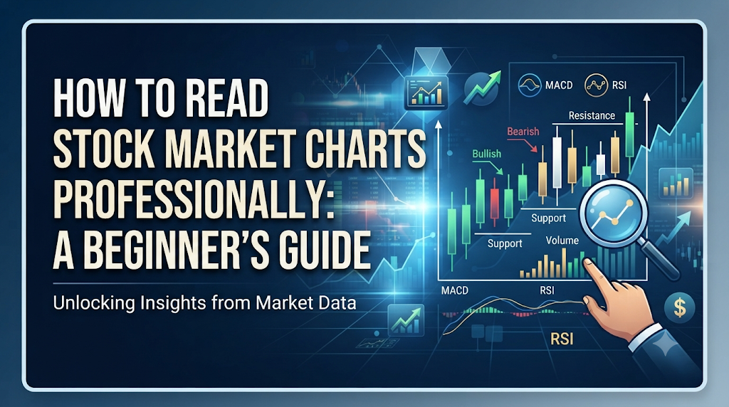
Introduction
Many new investors open a stock trading app for the first time, look at a price chart, and feel completely lost. Lines zigzag up and down, green and red bars flash on the screen, and numbers tick past in milliseconds. It looks like a complex math puzzle meant only for Wall Street experts.
Because charts look so complicated, many beginners either guess blindly or copy tips from social media. Both habits usually lead to losing money.
The truth is, stock charts are just visual stories of human behavior. They show how buyers and investors feel about a company at any given moment. You do not need a degree in finance to read them. You just need to learn the alphabet of charts: time, price, trends, and volume. This guide will teach you how to read stock market charts like a professional, using simple words and real-world logic.
What Is a Stock Market Chart?
A stock market chart is a visual graph that tracks how a company’s stock price changes over a specific period.
Think of it like a weather report for money. Instead of tracking temperature and rain, it tracks how much buyers were willing to pay for a share of a company and how much sellers were willing to accept, minute by minute, day by day, or year by year.
Why Does It Matter?
If you want to buy a car, you look at its mileage, condition, and past repair history to see if it is worth the price. In the stock market, a chart is your history book. It helps you see if a stock has been growing steadily or crashing wildly, so you do not buy at the absolute worst possible time.
How Stock Charts Work
To read a chart, you must understand its two main axes:
- The Horizontal Axis (X-axis): Shows time. This can range from minutes (intraday trading) to decades (long-term investing).
- The Vertical Axis (Y-axis): Shows price. This tells you how much one share of the stock costs in dollars or your local currency.
Depending on your broker or trading platform, you can view this data in different styles:
- Line Charts: A simple line connecting closing prices over time. Great for seeing the big picture, but lacks detail.
- Bar Charts: Show the high, low, open, and close price for each time period using vertical lines with small horizontal ticks.
- Japanese Candlesticks: The most popular choice for traders. They use colored blocks (usually green/white for price up, red/black for price down) to show the opening price, closing price, highest price, and lowest price of a specific timeframe.
Important Factors to Understand
Before diving deeper, you need to grasp three core building blocks that make up every professional chart analysis: timeframes, trends, and volume.
1. Choosing the Right Timeframe
A timeframe is the span of time each candle or point on the chart represents.
- Daily Chart: Each candle represents one full trading day. This is best for swing traders and medium-term investors.
- Intraday Chart (e.g., 5-minute or 15-minute): Each candle represents 5 or 15 minutes. This is used by day traders who buy and sell within the same day.
- Weekly Chart: Each candle represents one week. This is best for long-term investors looking at big-picture health.
2. Spotting the Trend
A trend is the general direction in which a stock price is moving. Professional traders live by the rule: “The trend is your friend.”
- Uptrend: The stock makes higher highs and higher lows. Buyers are in control.
- Downtrend: The stock makes lower highs and lower lows. Sellers are in control.
- Sideways Trend (Consolidation): The price moves horizontally in a narrow range. Neither buyers nor sellers have control.
3. Understanding Volume
Volume is the total number of shares traded during a specific time period. It is usually shown as vertical bars at the very bottom of your chart. Volume is the fuel behind price movements. If a stock price shoots up on high volume, it means big institutional buyers are interested. If it shoots up on low volume, it might just be a false move that will quickly fade.
Detailed Explanation: Anatomy of a Japanese Candlestick
Because candlesticks are the industry standard, let us break down how to read a single daily candle.
A candlestick has a thick body and thin lines sticking out of the top and bottom called shadows or wicks.
- The Body: Shows the starting (open) and ending (close) price for that day. If the close is higher than the open, the body is green (buyers won). If the close is lower than the open, the body is red (sellers won).
- The Wicks: Show the absolute highest and lowest prices reached during that day before settling at the close.
Example
Imagine Apple stock opens at $150 in the morning. During the day, panic hits the market, and it drops to $145 (the lower wick). Then, strong buyers step in, push the price up to $158 (the upper wick), and the day ends with the price closing at $155. The candlestick will show a green body from $150 to $155, with long wicks reaching down to $145 and up to $158. This tells a professional trader that buyers fought back hard after an early morning dip.
Practical Examples
Let us look at how an investor uses these concepts in real life.
Imagine you are looking at a retail company stock. You pull up a Daily Chart and notice it has been in a steady Uptrend for six months, making higher highs and higher lows.
However, you notice something strange today: the stock price jumped up slightly, but the Volume bar at the bottom is tiny—the lowest it has been all month.
An amateur investor sees the green price candle and thinks, “Great, it’s going up, I should buy more!”
A professional chart reader thinks, “The price is ticking up, but nobody is actually trading. There is no heavy volume or big buyer backing this move. This is weak. I will wait for a pullback or look for strong volume confirmation before risking my money.” A few days later, lacking buyer support, the stock drops back down. Reading the volume saved you from a bad entry.
Common Mistakes
Even smart people make avoidable errors when reading charts. Here are the most common traps:
- Mistaking Noise for Trends: Looking at 1-minute charts and panicking over every tiny wiggle.
- Why they do it: Impatience and fear of missing out.
- Why it causes problems: Short-term charts are full of random noise driven by computer algorithms.
- What to do instead: Always check the daily or weekly chart first to understand the main trend before looking at shorter timeframes.
- Ignoring Volume: Looking only at the price lines and ignoring the volume bars at the bottom.
- Why they do it: Price is colorful and exciting; volume looks like boring bar codes.
- Why it causes problems: Price moves without volume backing them are often traps that reverse quickly.
- What to do instead: Make volume your second check on every trade setup. If volume is missing, treat the price move with extreme caution.
- Overcomplicating the Screen: Slap-dashing 10 different technical indicators onto a single chart until you can no longer see the actual price candles.
- Why they do it: Believing that more indicators equal secret knowledge.
- Why it causes problems: Indicators give conflicting signals, freezing you in analysis paralysis.
- What to do instead: Stick to price action, trend lines, and volume. Add at most one or two indicators (like a moving average) that you truly understand.
Risks and Limitations
Charts are powerful, but they are not crystal balls. They come with distinct limitations:
- They Show the Past, Not the Future: A chart only records history. It cannot predict sudden black swan events, like unexpected company bankruptcies, sudden lawsuits, or global economic crises.
- False Breakouts: Sometimes a stock price breaks above a clear resistance level, tricking traders into buying, only to crash right back down.
- Emotional Bias: Humans are great at seeing patterns that do not actually exist because we want a trade to win.
How to Reduce Risk
Always use stop-loss orders to limit your maximum financial loss if a chart pattern fails. Never risk more capital on a single stock than you can comfortably afford to lose.
Decision-Making Framework
When you analyze a stock chart, run through this simple professional checklist before making a move:
- Step 1: Check the overall trend on the daily or weekly chart. Is it moving up, down, or sideways?
- Step 2: Identify major support (where buyers usually step in) and resistance (where sellers usually step in) levels.
- Step 3: Look at current volume. Is buying or selling pressure strong or weak?
- Step 4: Check for upcoming company earnings reports or major economic news that could shatter chart patterns.
- Step 5: Define your entry price, your profit target, and your stop-loss level before placing any trade.
Key Terms
- Bullish: A market condition or sentiment where prices are expected to rise.
- Bearish: A market condition or sentiment where prices are expected to fall.
- Support Level: A price point where a falling stock tends to find heavy buying interest, stopping it from falling further.
- Resistance Level: A price point where a rising stock tends to face heavy selling interest, stopping it from rising further.
- Moving Average (MA): An indicator that calculates the average price of a stock over a specific number of past days, smoothing out daily price noise to show the true trend.
- Breakout: When a stock price moves decisively above a resistance level or below a support level on high volume.
- Retracement: A temporary minor dip or pullback in the direction opposite to the main prevailing trend.
- Liquidity: How easily a stock can be bought or sold in the market without causing drastic price changes.
FAQs
Can chart reading guarantee I will make money in the stock market?
No. Chart reading is a probability game, not a certainty. It helps you tilt the odds in your favor by finding favorable risk-to-reward setups, but unexpected news can always disrupt a chart pattern.
Do I need expensive software to read stock charts?
No. Most major online brokerages and free financial websites provide clean, professional charting tools that include candlesticks, volume, and basic indicators at no extra cost.
What is the best indicator for beginners?
The simple moving average (like the 50-day or 200-day moving average) is widely considered the best starting point because it clearly shows the long-term health and direction of a stock without cluttering your screen.
Why do some candles have no wicks?
A candle with no upper or lower wick means that the opening or closing price was the exact high or low price for that entire time period, showing very strong, one-sided momentum.
How much time should I spend looking at charts daily?
It depends on your style. Long-term investors only need to check daily or weekly charts once a week or once a month. Day traders look at charts continuously during market hours.
Conclusion
Reading stock charts is a skill built through patience, practice, and consistency. Treat charts as a window into market psychology rather than a magic formula. By focusing on clean price action, clear trends, and supportive volume, you can cut through the noise, avoid amateur mistakes, and make calm, calculated investment decisions.